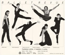
Harmony and proportion in art are important elements to create visually pleasing works, and were used in artistic practices since the Egyptian Pyramids. Although it is said that human brain is wired to prefer images and objects that use Golden Ratio, in art and design this often boils down to aesthetics. However, aesthetic ideal of beauty is not the only principle guiding proportion in art. Proportion is often manipulated in different ways regarding the message an artist is trying to convey. Being visually pleasing seems less important today when visual practitioners engage with a wide range of themes, often requiring distortions and manipulations of reality for the most effective results. So, What is the definition of proportion? First thing that comes to mind is Golden Ratio, Divine Section, or Golden Proportion – these are some of the terms used to describe one of the most famous examples of proportion in art. Considered the ideal one, Golden Ratio is defined through precise mathematical equation in which a line divided into two parts where the longer part (a) divided by the smaller part (b) is equal to the sum of (a) + (b) divided by (a), and both equal 1.618.
Principle of Proportion
Proportion is the relationship of two or more elements in a design and how they compare with one another. Proportion is said to be harmonious when a correct relationship exists between the elements with respect to size or quantity.
Good proportion adds harmony, symmetry, or balance among the parts of a design.
The effective use of proportion in design is often referred to as harmony, a relationship in which the various elements of the composition appear as if they belong together in size and distribution.
For example, if one figure is made to look larger compared to other figures in a composition, it is said to be out of proportion and is given greater importance.
Proportion design examples:

Maintaining proper portion when creating a design is critical to ensuring that the design has a harmonious overall feeling. You wouldn’t want to put in elements that are completely out of proportion to one another if you’re aiming to create a realistic effect. On the other hand, if you’re trying for a comical feel, you may find that unrealistic proportions are a great way to accomplish it: in a caricature, for example, artists often play with proportion to emphasize certain elements.
Proportion in design refers to the relative size of the elements in the design. In graphic design, you may not necessarily need to worry about the actual size of a specific design element, but you may be much more deeply concerned with the relationship of specific elements to other elements within the design itself.
For example, if you put together a comic panel including a number of figures, you may want to make sure that those figures are proportionate to one another and their surroundings. If your figures are the size of a building, it could indicate that they have become giants, or that they are standing far away from the building itself. By keeping those elements in proportion, on the other hand, you can create a much more effective final design.
Rule of Thirds
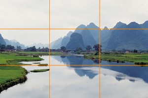
Many designers and artists are aware of the rule of thirds, where a picture is divided into three sections vertically and horizontally and lines and points of intersection represent places to position important visual elements. The rule of thirds can be a very useful guide for composing designs.
One can analyse photographs and designs by laying down grids.

Proportion is an important principle of design, and an excellent tool to help us as we make decisions about layout. But it is not the only tool; there are other elements and principles to consider as well. In placing visual elements for an effective composition, one must assess the other elements and principles of design including shape, texture, colour, dominance, balance, etc.
Thus it can be confidently said that design and proportions are a critical to each other and helps make our designs likeable by the eyes and the mind.
